Recently a client wanted me to recover some data for them. Their data was in an antiquated version of our software, so I had to dig through my archives to try and find a platform that would work with their data. I eventually found an old virtual machine lying about that had a compatible version of the database and I was able to access their data, export it and import it into a current software version.
While I was digging around I found an old OpenJournal archive. OpenJournal was, from the marketing: “the leading solution for Web-based knowledge capture and sharing among E&P business units” – basically it was a simple tool for knowledge capture and workflow that was built on a very early version of Java (1.1). It was the first program that I had taken from the initial concept all the way through to delivery on desktops around the world.
There were a number of geologists in our company who would carry out projects on a consultancy basis. OpenJournal was created to allow them to document their projects as they went along. Previous to that they would make copious notes and print screenshots. Once done it all would go off to the secretary to be typed up. That would all have to be read through and corrected. OJ streamlined the whole process and the end product could either be printed off or sent to the client on a disk.
I had already created several VMs in the process of data recovery, so I couldn’t resist taking OJ for a spin!
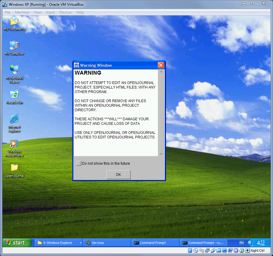
This rather scary warning is the first thing that you see when you run OpenJournal! User Interface Design Principle No. 1: Scare the bejeesus out of the user! When we originally developed OJ we were very much thinking in terms of minimalism. The program allowed you to create your content with a few basic tools, rather like a cutdown version off Offce, this would then be output as HTML. This meant that OJ content could not only be viewed in OpenJournal, but also by anyone with a web browser.
At some point we had the genius idea of adding our data into the html files in the form of comments. What we didn’t take into account was that people would then mess about with those html files which would then trash OJ’s data! After several support calls, version 1.1 had to be hastily pushed out with this horrible warning. The lesson here is clear – never trust the user and obfuscate your data! If memory serves 1.1 also had to address the fact that Unisys started to license the use of gif files and we had to remove those.
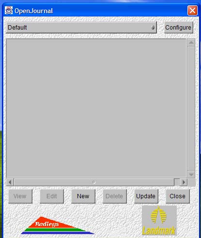
The Project Manager window. Look at those badly scaled graphics! The Landmark one doesn’t even have the right background! We were programmers not graphic designers! Also that weird artex stipple effect!
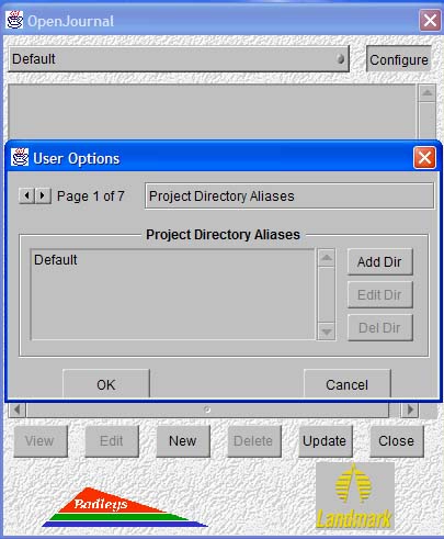
User Options. 1 of 7! This was always my least favourite part of the UI. It was a custom widget. I haven’t seen anything like it before or since! It did the job though.
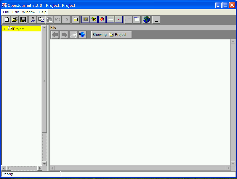
And here we have the main interface to OpenJournal. The left side was a tree like structure for your project and the right side was the editor/viewer for your content. Then along the top you have the toolbar. To create a new item you could either click or drag and drop one of the 5 toolbar objects in the centre of the toolbar. Text Editor, Image Editor, New Page, Separator and small red spot.
Initially all the different parts of OJ came up as separate windows, then towards the end of the initial development there was an emergency meeting where it was decided that it would be better to have everything in one window. It was a bit of a nightmare resdesign, but with hindsight it was very necessary. If you’ve ever used GNU’s GIMP editor you’ll know what a pain having lots of separate windows can be!

OpenJournal could be toggled to a draggable toolbar. This way you could keep the program on screen while you got on with your work and it was still easily accessible. I always thought this was quite neat. I have no idea if the users ever made use of this feature.
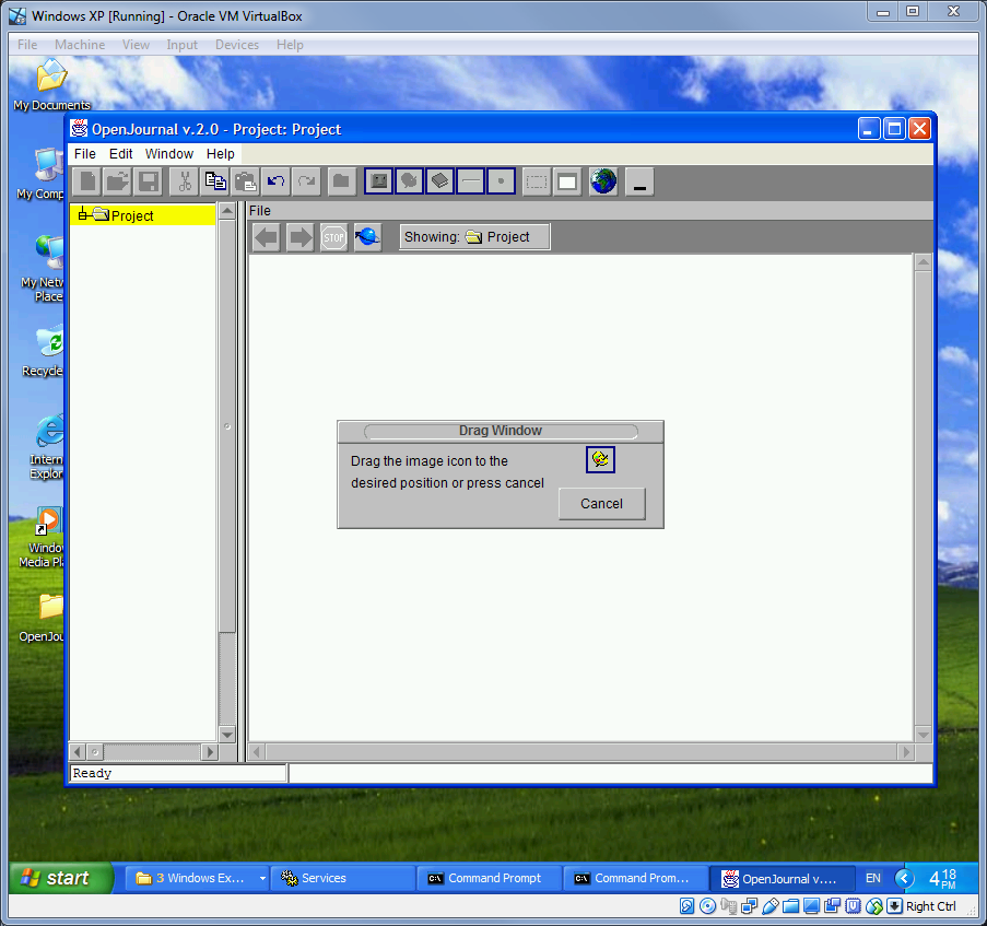
One of the really useful features of OJ was that it allowed you to take a screengrab of what you were doing and then annotate it. When you ran the screen grab you were presented with this video and you would then drag the little image where you wanted it etiher on the viewer or the hierarchy.
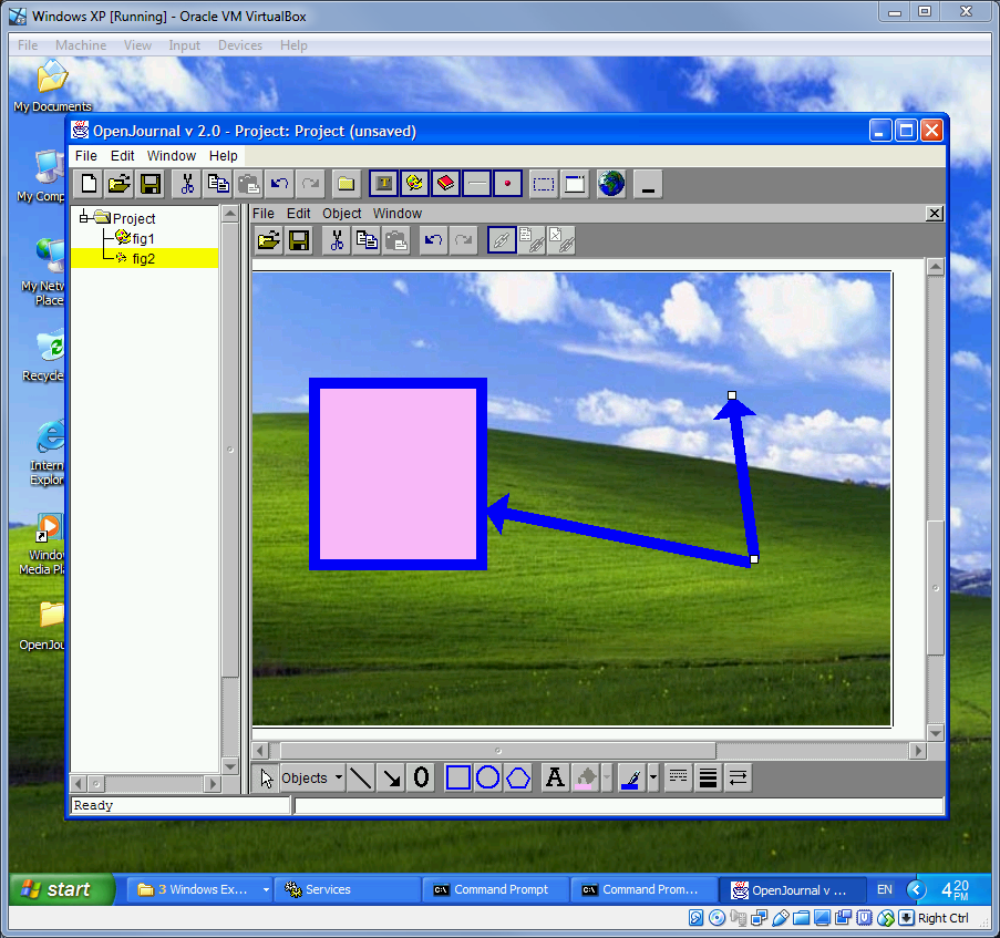
This would then open up your screengrab in the image editor. Even now, the striking thing is how easy it is to use. There are a fairly limited set of tools – there were no libraries or toolkits – everything had to be coded from scratch. Even something simple like drawing a line – all had to be mathematically worked out. I had to go back and relearn trigonometry.
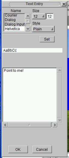
This monstrosity is the tool for entering text! You were limited to the fonts made available to Java. I’ve changed my mind. This is the ugliest part of the UI!
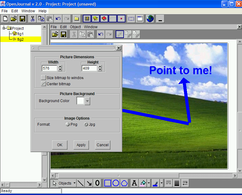
Resizing images was a bit fiddly though. The Apply button helps though.
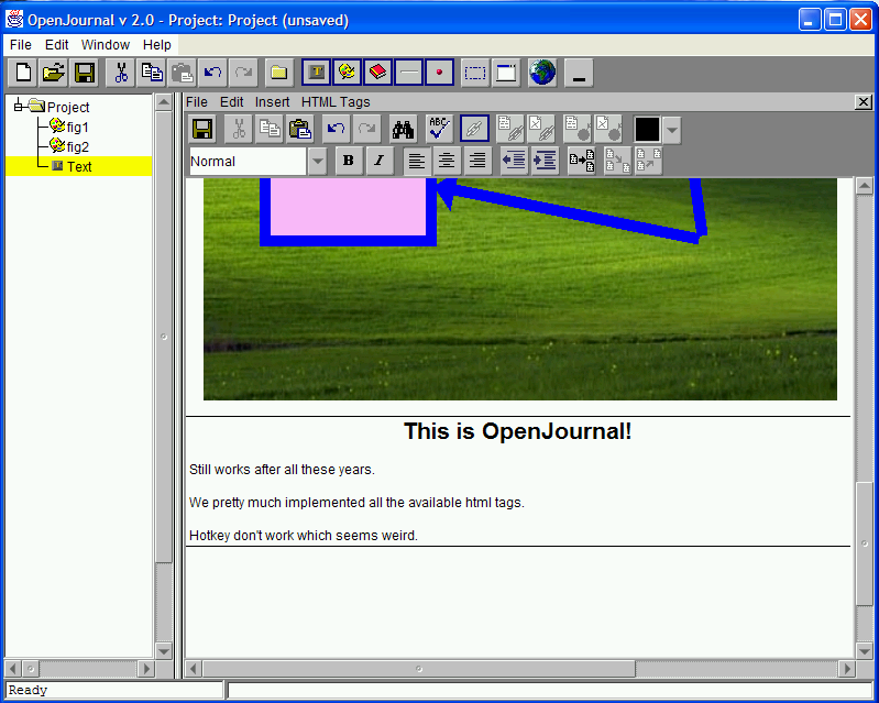
The other main editor was the Text Editor. Again it feels really intuitive. Modern software is so bloated, you spend half your time trying to find the thing you need or googling how to do the thing you want. OJ was simple, but it did what you wanted.
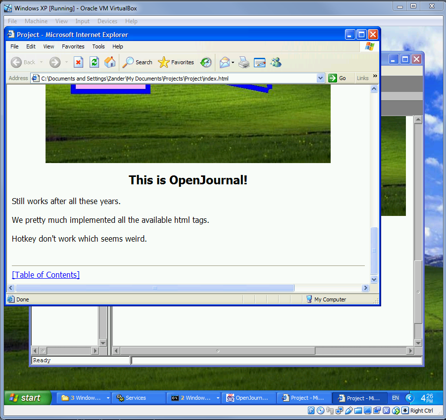
And here’s end result. You create your content and anyone in your organization that needed to, could then access it either through the browser or through OJ.
Despite being 20 years old, OpenJournal feels surprisingly intuitive – and responsive. There is a lot to like about it and there is definitely a lot to be said for a time when software was easier for the end user to pick up and use. Perhaps there is a lesson there for future development plans!
As the K.I.S.S. principle teaches us: Keep It Simple Stupid!
