This has been the company logo for the last 8 years. The new WordPress themes require a squared logo and our current logo doesn’t really work very well when squared.

Tulltech Site Icon 
Tulltech Site Icon 
Tulltech Site Icon
These initial attempts involved adapting the current logo, the idea being that we would keep the current logo, but also have a complementary icon. I wasn’t best pleased with any of them.


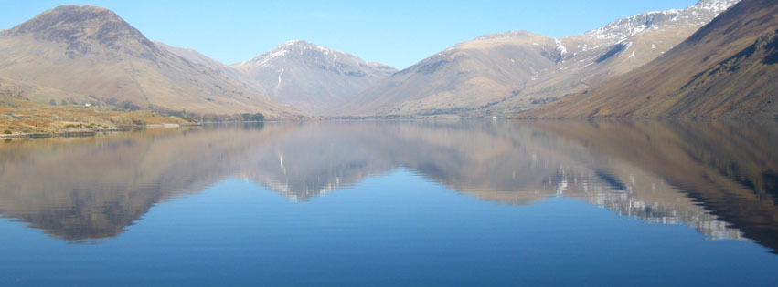
So here’s the new logo. I can’t make up my mind which version I prefer though. The mountains reflect our location in Cumbria, only a few miles away from one of the most spectacular views in the whole country:

